


Introduction
AWS Amplify provides a set of user interface components that can be used to speed up development of web and mobile based applications.
In this article, I'm going to show how those components can be customized so that they match the look and feel of your applications. In a future article, I'll show how to write new components that still use the Cognito authentication services, but allow a complete redesign of the user interface components.
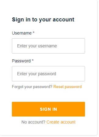
I'm going to concentrate here on the Amplify Sign In screen and show how we can modify it (the same techniques can be used for the other screens, such as sign up, forgotten password etc.). Before we make any modifications, however, lets take a look at the default login screen.
Changing Screen Text
In this article, I'm concentrating on React, but the same principles hold true for whatever components you're using.
Within React, we can specify that a component is on a secure page by wrapping the component within an <AmplifyAuthenticator /> element
import { AmplifyAuthenticator } from "@aws-amplify/ui-react";

function App() {
  return (
    <AmplifyAuthenticator>
    .. application components here
    </AmplifyAuthenticator>
  );
}
Within the AmplifyAuthenticator component, Amplify uses "slots" to allow for the component to be customized.
MDN defines a slot as
a placeholder inside a web component that you can fill with your own markup
So basically, by using Slots, the Amplify UI components can be customized easily by specifying different props within the JSX. For example, we can change the welcome message on the login screen or remove the option from the login page to sign up to the application, etc.
OK, so we know that there are 'slots' within the authenticator component, but what are they ? Well, there are currently 10 different slots:
confirm-sign-inconfirm-sign-upforgot-passwordgreetingsloadingrequire-new-passwordsign-insign-uptotp-setupverify-contact
You can probably work out what the slots are for from their name, however in this article, we'll only be looking at the sign-in slot. You can get details of all of the slots from the Authenticator documentation
To modify the sign in page, we must add props to the <AmplifySignIn /> component within the <AmplifyAuthenticator /> This component contains several props that we can modify to control how the component is displayed:
formFields- determines what fields are visible within the component and how they are displayed. We'll see an example of this shortly.headerText- The header text displayed at the top of the component.hideSignUp- If present, hides the sign up link from the component.submitButtonText- The text within the Logon button.
This list details some of the more common properties. A full list is available within the documentation.
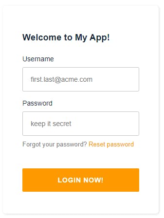
So, let's make some modifications to the login form. We're going to hide the sign up option. We're going to change the title to read "Welcome to My App!" and we're going to add some placeholder text within the username and password fields. To achieve these effects, we're going to set some props on the <AmplifySignIn /> component
    <AmplifyAuthenticator>
      {
        <AmplifySignIn
          slot="sign-in"
          headerText="Welcome to My App!"
          hideSignUp
          submitButtonText="Login now!"
          formFields={[
            {
              type: "username",
              label: "Username",
              placeholder: "first.last@acme.com",
              required: true,
            },
            {
              type: "password",
              label: "Password",
              placeholder: "keep it secret",
              required: true,
            },
          ]}
        />
      }
      ... secured page goes here.
Once we've made these changes, the login page looks like below.
Changing Screen Styling
So far, we've changed the text on the login page, but the display still uses the default Amazon colors. In this section, we're going to see how we can change the styling of the Amplify components using CSS.
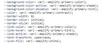
Amplify uses CSS variables to define the styles used for all of its components. These are fully customizable and allow us to change different CSS properties such as the font and colors of components.
There are properties to change the primary/secondary/tertiary color, contrast, tint and shade used in the components along with a couple of standard colors such as white, grey and red. There are also CSS variables to set the font and font sizes used. In this article, we're going to have a look at the following CSS variables:
--amplify-font-family--amplify-primary-color--amplify-primary-tint--amplify-primary-shade--amplify-font-family--amplify-white--amplify-secondary-tint
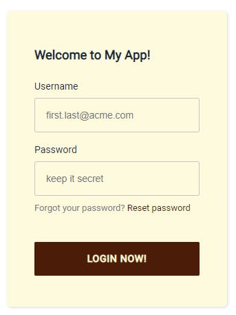
To set these variables, we apply them to the :root selector within the applications CSS file.
:root {
  --amplify-primary-color: #4b1c08;
  --amplify-primary-tint: #b36627;
  --amplify-primary-shade: #783b17;
  --amplify-font-family: "Roboto", sans-serif;
  --amplify-white: #fdfade;
  --amplify-secondary-tint: #b36627;
}
Having changed these values, we can see that the styling of the login page now changes to takes on our new values.
So, how did I know that the login button, for example, uses the `--amplify-primary-color CSS variable? To work out what colors need changing, I used the browser's Dev Tools. This is a really quick way to see what CSS variables are used in different places.
Conclusion
In this article, we've seen how we can change the controls that are displayed on the AWS Amplify default components, and how we can change the text that is displayed within them. We've also seen how we can apply some CSS styling to change the look and feel of the components.
Although we've made minimal changes, using the techniques described above, we should be able to change the look and feel of the default Amplify components to fit in with any applications we write. In a future article, I'll show how we can completely rewrite these components and develop the security screens to any design.
I hope you've found this useful. Please leave any comments or thoughts below.
Happy Amplifying !
Credits
Photo by Anna Kolosyuk on Unsplash